Patek Philippe and its new World Time collection addition
Patek Philippe brings a bold carmine-red dial to its World Time collection.
- Words By Scarlett Baker •
- Photography by Courtesy of Patek Philippe
We reside in a world of prolific interconnectivity – but there were tools to help connect the dots from one corner of the world to another long before the advent of digital-mania. Enter Patek Philippe and its World Time collection in the 1930s, joining together cities across the globe, meaning you could tell the time in Moscow or Mexico, all at the helm of your wrist.

Patek Philippe’s carmine-red World Time.

The movement behind Patek Philippe’s World Time.
For 2026, Patek Philippe introduces a new colourway to the collection – one that carries further visually than the distance between London and New York ever could: carmine red.
In colour theory, it translates as a hue that is expressive, but never shouts. Such is the case for the storied Swiss watchmaker’s own ethos – to give depth, but never divulge in excess.

Hand-guilloché detail beneath the red lacquer.

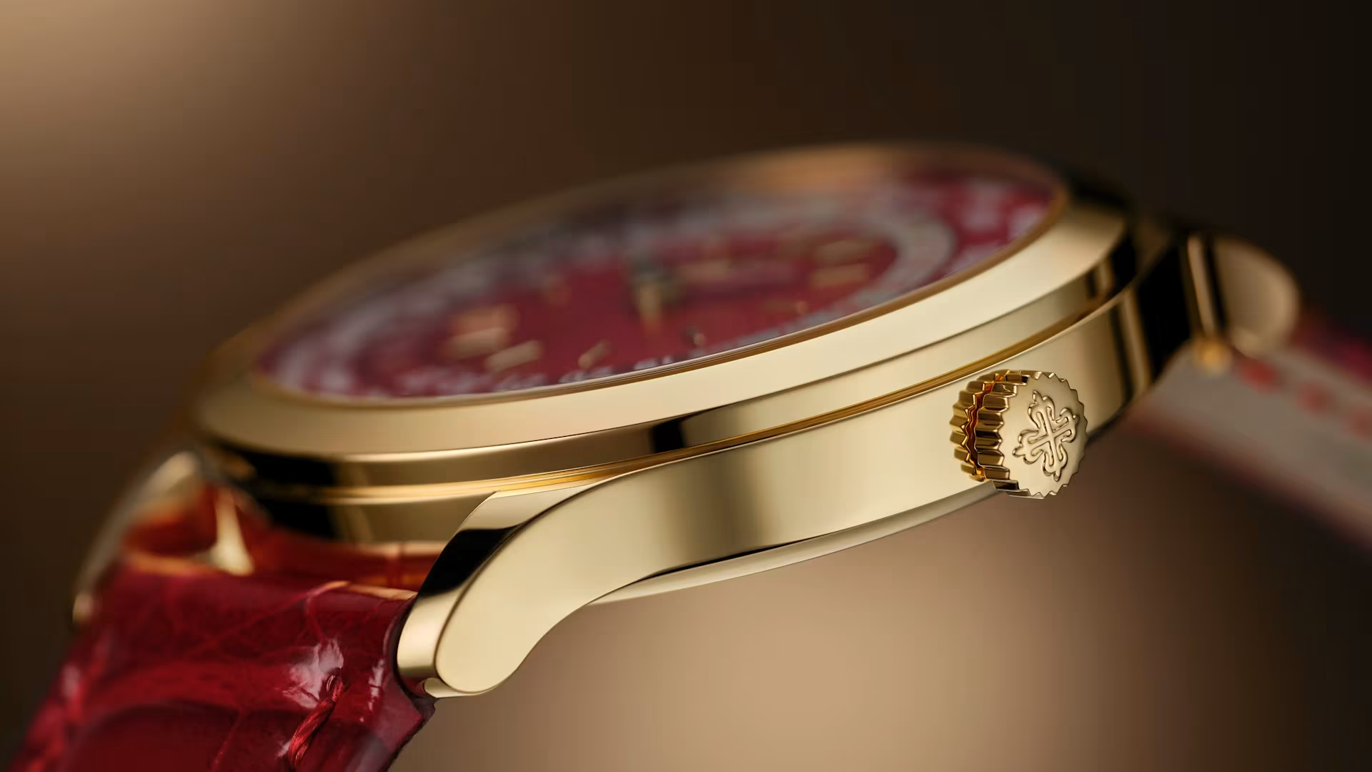
The World Time’s yellow-gold case in profile.
The centre of this watch’s story is the dial, with a rich cascade of red lacquer layered over hand-guilloché work (a decorative geometrical pattern). This texture is anything but flat – befittingly, much like the misconceptions of the Earth’s own surface – it shifts and catches the light as it turns. Encircling it, the 24-city ring and day–night disc compress global time into a single, legible architecture. Rather than overwhelm, the composition is tightly orchestrated: a punchy companion for those who favour the jet over the jet lag on the itinerary.


